Search

DIY LUMINOUS POUR PAINTING with LIQUITEX POURING MEDIUM

Big Flow - Acrylic Pour Painting in Warm Hues copyright 2014 by Linda Ryan
Big Flow – Acrylic Pour Painting in Warm Hues copyright 2014 by Linda Ryan

www.lindaryanfineart.com  <— in case my lack of tech-ability got you lost

Hi Friend in Art-

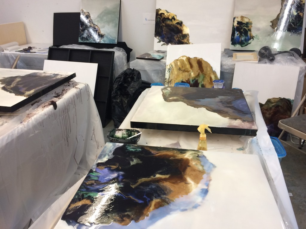
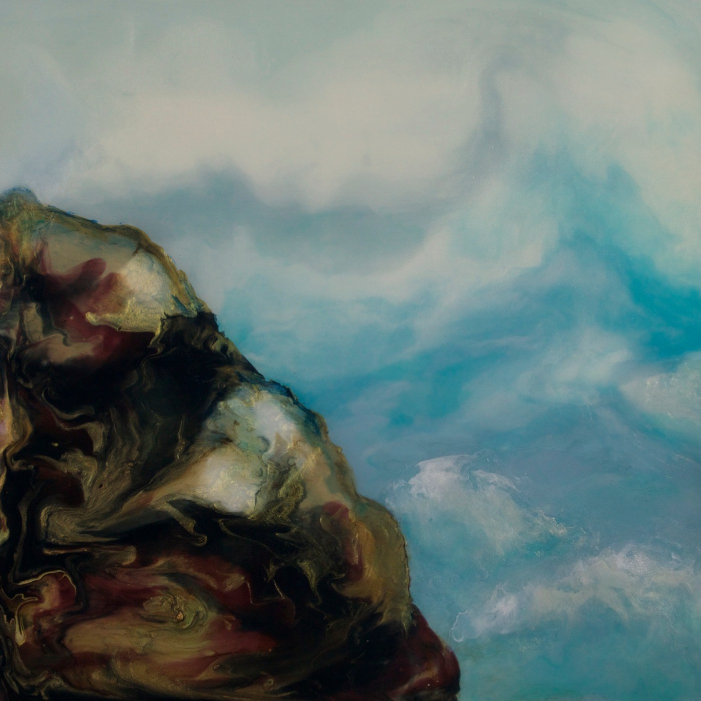
Here’s some good stuff that can help you make Luminous Pour Paintings at Home.  To keep it luminous, make sure to use mostly transparent pigment.


Small Acrylic Pour Painting Copyright 2015 by Linda Ryan
“Rising”, Pour Painting Copyright 2015 by Linda Ryan – this one was built in two layers  – oranges first, allowed to dry, then blues

Basic Luminous Pour Painting

Let Go and Create Using Gravity as Your Brush

It’s an exciting, liberating way to create beautiful, movement-filled, luminous art.

It forces you to let go of total control and let the medium and the pigments frolic and play to make some flippin cool stuff.

Of course, the more you explore it, the more control you have – but never like you would with a brush.

That’s a good thing. Free up.

Let’s Get Started

Basic Supplies (general list, detailed information to follow):

  • Poly tarp (heavy duty plastic can be found at Lowes or Home Depot)
  • Gloves
  • Plexiglas scraps (for practicing)
  • Cradleboard
  • Gesso (brand suggestion: Not fussy about this)
  • Liquitex Pouring Medium (THIS IS MAGIC STUFF – WOOT WOOT!!!)
  • Acrylic paints (recommend: Golden Fluid Acrylics or Liquitex Soft Body)
  • Small plastic containers for mixing/storing variety of colors
  • Dixicups (optional, but used for propping pieces off table)
  • Tub to collect paint drippings

Colors:

First, pick your color choices for this painting. I’m providing some of mine as examples.

Paint Group Suggestions

For your first Luminous Pour Paintings, I’d suggest picking a group from the list below; a few light, transparent paints, one or two darker, and a few metallic or interference colors. In your first paintings, try to aim for a more light than dark, create movement with a smaller amount of the darks, and highlights of opaque or metallic or interference paints. Play with one group of colors before moving on so that you can start to get a feel for it

Let go of the need to be perfect!

Warm:

  • Quinacridone gold – or transparent yellow iron oxide
  • Quinacridone burnt orange
  • Mixed blacks/brown (ex Anthraquinone blue and Quinacridone burnt orange)
  • Interference gold and/or orange (mixed fairly thickly, but evenly)
  • Any metallic gold or bronze

Cool Toward Purple: 

  • Pthalo blue (blue shade)
  • Mixes of degrees of blue (blue shade) or Anthraquinone blue and Quinacridone magenta
  • Quinacridone magenta on its own, or pushed a bit with pthalo or anthraquinone blue, or shaded down with a touch of pthalo green
  • Opaques – white, or interference blue, violet, or even a little gold
  • Mixed black from Quinacridone magenta and Pthalo green (may need a touch of transparent iron oxide to push it)

Blue, sea tones:

  • Pthalo blue (green shade) some lighter, some darker
  • Pthalo green, blue shade
  • Transparent Yellow Iron Oxide
  • Transparent Red Iron Oxide or Quinacridone Burnt Orange
  • Mixed black from Pthalo Blue and Quinacridone Burnt Orange
  • Metallic golds or bronzes
  • Interference gold or green

TEST IT OUT:

Snag a Plexiglas panel and some gloves. Put the gloves on.

Pick a light and a dark paint from the group you choose. Pour three half dollar size puddles of your light, three quarter sizes of your dark. Squiggle some metallic or interference pain around.

Start tilting!!! Don’t be afraid of diagonal tilts either, or reversing a tilt. The idea here is to see what the paint does, what happens when you tilt it sharply or lightly, how they flow together, stick stubbornly, mingle, drip it off the sides, make a general mess. You can’t ruin it – this is practice.

Find what you like, (or liked, as it probably changed as you tilted it) and think about what you did to make that happen.

Stuff You Will Want to Know

Mixing Your Paint with Pouring Medium

Mixing can sometimes be the most time-consuming step, but if you do it right, your piece will be better in the end.

  • Carefully pour some medium into a jar or cup, then add a few drops of your pigment, then more medium, and more drops. Pour carefully to avoid a lot of bubbles. This medium can froth and you can end up with a frothy bubbly painting instead of the resin-like surface this medium is meant to help you create.
  • Start stirring with a plastic spoon, lifting the mix from the bottom up. If you swirl from above, you risk introducing a lot of air, creating bubbles.
  • About the bubbles – Never shake pouring medium! If you do, you have to wait for it to settle down before it’s usable.

Getting the color you want:

This medium is almost milky translucent. It won’t be when it dries – it’ll be clear. It makes your colors look lighter. This isn’t yet the forum for a lot of color theory, but these tips will help:

  • Mix black from lots of drops of transparent paints
    • Alizarin Crimson + Pthalo Green
    • Anthaquinone Blue + Quinacridone Burnt Orange (My Fav)
  • Mix Great Brown by adding more of the Alizarin Crimson or Burnt Orange
    • They won’t look black or brown – test it on white paper or the plastic tarp.
  • Really Light Colors – if you want really light colors like baby blue, instead of adding white, which makes it opaque and deadens the luminosity, just use very few drop of your blue and let the medium separate the pigment particles and bounce light between them and give you your light color. You will be using light instead of paint to make a light color – as long as you are working on a white or gessoed surface. Test it by rubbing some across white paper or your tarp.

How much do I mix up?

More than you think you will need. You always need more than you think. Store leftovers in an airtight container.

 ____

OK let’s make a beautiful mess!

In your first paintings, try to aim for more light than dark in the beginning, create movement with the darks, and highlights of opaque or metallic or interference paints. Play with one group of colors before moving on so that you can start to get a feel for it.

Let go of the need to be perfect. You are learning.

Gloves on!

  • Pour your main light first – this is the most paint you will use with this beginning project. For your first project, don’t over thing where it will end up – just pour where you’d like it to start.
  • Add another medium color if you want where you want
  • It’s a fun time to put in a bit of interference or metallic if you like that stuff
  • Using small tilts, tilt to the side, tilt it away from you, and tilt to the other side if you want, and then tilt toward you to spread it around a bit. It’s ok if some of it runs off the side.

Add Your Darks

  • Don’t be symmetrical about this!
  • Choose where you want to start your darks. Try to avoid too much symmetry. Symmetry kills motion. Balance is good, but achieve it without doing one there, one here, one there, one here …
  • Add puddles or swoops of your blacks, smaller browns perhaps next to, in or near them, and then add some small areas of bronze and/or interference gold and/or metallic bright gold … these are just starting tips. You can totally experiment one you get the concept down.
  • If you want to lighten an area, you can pour clear pouring medium in that area.
  • Note—Adding anything to an area will push the paint next to it away a bit, in general, and even more so when you tilt it toward that paint. Sometimes you may want to do that on purpose.

Time to Really Tilt that Puppy

  • Try not to do exactly the same order of tilt as before. You can try a little tilt at first, at this point can tilt it the other way if you don’t like it and a lot of it will correct itself. Diagonal tilts are often effective at this stage. You can also run a gloved finger to mingle some paints together (this is great with bronzes, golds, etc. that like to stick together and float around the top).
  • You might want to get brave and do a big tilt or a diagonal tilt – or tilt and turn and tilt and do little titls. Stop and look at it once in a while. I had no idea how often and long I just stopped and stared at a pour painting in process until I started working on YouTube demonstration videos. I think I’ll cut those parts out.
  • Try to remember where your darks may have anchored themselves to the board – you may only see a ghost of them now through this glue-like stuff, but you will see them when it all dries and it can really change the composition.
  • Don’t worry too much, through, you can do another layer later if it isn’t quite there.
  • While it’s still wet, you can squeeze, drop or pour your mixed paint into holes that are left on the surface, use a gloved finger to encourage paint to meld together or swirl, or to shore up funky edges and gaps. You might want to use that gloved finger or the back of a spoon to soften up the edges if you do that, or to bring paint out to the edge of the painting.
  • If it’s started to dry, don’t add more paint. You can do a little of this later, or do a completely new pour on top as long as it’s all dry (wait a couple of days to make sure … unless it still looks milky, and that means waiting even longer)


Be Done Before You Think You are Done

When you are done, wipe off the sides with your gloved finger (just to smooth it out a little) and if your working surface isn’t level, transfer it to a level surface and let it dry on top of Dixie cups (you can add extra Dixie cups to the one side to make it more level if needed). Make sure the surface is protected – this can really run if not level, and engulf whatever is in its path.

Keep Pets and Small Children Away

I know from experience that cleaning up gooky cat paws and paw prints on a floor is no fun and the cat doesn’t like it much either. Rubbing alcohol can help the floor. There’s nothing much for the cat but soap and water.

Plus it messes up your composition big time!

Bonus Tip

ITCHING TO STILL PUSH IT AROUND? After about 30 min – 2 hours depending on your humidity, heat and airflow, the cloudiness in the top surface will have cleared just a bit and formed a skin. Doesn’t mean you should touch it! BUT—if as it starts to clear you don’t like what’s going on underneath, you may be able to nudge the underlying layers in a different direction by giving it a little tilt. This is because the bottom layer is still wet and moveable.

Don’t nudge it too far, you can end up with weird buckles and bumps on your surface. Sometimes I’m ok with that. If it’s not too thick, you can correct it with a clear pour.

Tips & Tricks: Tools & Materials

General:

  • GLOVES! – Always wear gloves. This is like glue and your cuticles will hate you!! You will need more than one pair. I always end up with interruptions while my gloves are goopy and have to tear them off and grab another pair. You can use less gloves if you keep a bucket of water around and drop them in it (and remember to fish them out later for drying).
  • Yucky clothes & shoes. You will get it everywhere. If you are a very meticulous sort, definitely use yucky clothes and shoes and make sure to drop some paint on them right away. Then you’ve already been messy so you can stop worrying about it and let loose.
  • Poly tarp or large black garbage bags to protect your painting surface and the floor. Poly backed paper tarps work really well on the floor – the medium dries faster on the paper. I like poly on my work surfaces, as my friend Virginia, a found-object artist, likes to peel all of the dried goo and create new art. I love that.
  • Airtight containers to mix and save the paint and medium mixes in. I’ve heart of people using Ziploc bags, but that sounds too intensely messy even for me. When your containers get too gunky to use, you can soak them in a bucket of bathwater (I’m in California and we are in a drought) and the paint will peel off. Same with your plastic spoons.
  • Toothpicks or – best – wooden skewers for kabobs for popping bubbles and sometimes to swirl your pigments together ( also like using a gloved finger or plastic spoon better for swirling – Less chance of funky white divots from scraping the surface)
  • Plastic knives, spoons for mixing and pushing paint around (I like spoons, but knives work well for dripping paint in a controlled fashion)
  • A level. You may be unpleasantly surprised to find out what your painting has done overnight if you leave it unlevelled. This stuff likes gravity and will go where gravity dictates. Always good to check it each half hour.
  • Paper towels, or rags
  • A bucket of water for dipping your gloved hand in to clean it off
  • Rubbing alcohol, for cleaning up drops and spills and, well, sometimes we start cleaning up without our gloves on and … it does not help het it out from under your fingernails.

Medium

  • At least 16 oz. of Liquitex Pouring Medium if you are working under 16” x 16” in size. In fact, if you really want to start to learn the medium, don’t get anything less than a 32 oz. You will jut get hungry for more, and that itch to keep doing it, and run out. Stop buying café coffee for a couple of weeks, or cut something else out. You can do it. Put it into your art instead.

Paint:

  • Acrylic, artist grade. Don’t use craft paint or cheap student grade. The matting fillers in it don’t work well with the medium.
  • Fluid or high flow paints mixes best
    • If you are a careful, slow mixer, you can make thicker bodied acrylics work with interesting streakiness, or really keep mixing and make it smooth.
  • I use a lot of Golden transparents as in the paint groups section. I like them.
  • Don’t buy pre-mixed black. Just don’t. Unless you want the black to be really forward, dead, on the surface. Then you should go for it. Post me a photo. Maybe I’ll change my mind.

Your Painting Support:

  • I like using sanded cradled board, with 2 or 3 coats of gesso.
    • You can use pre-gessoed Masonite – it’s too slippery for my taste but because of that you end up using less medium, so if you are on a budget, it’s a way to explore the medium without breaking the bank. It just doesn’t turn out as thick and luminous.
    • You can also use Plexiglas – it will adhere permanently to this. Not super thin – too thin will flex while drying and distort your work. Thin is ok for practice.
    • Canvas stretched on cardboard can warp, but is fine to use for practice.
    • The above 3 options will all need framing if you have a successful piece.
    • Stretched canvas sags and the medium puddles in the middle. If you like that, try it, but I don’t like the effect. I am toying with the idea of stripping a painting off the stretchers and mounting it on board, and then pouring over it … but I haven’t done it yet so can’t tell if it would be as awesome as I think it might be. Let me know if you try it.

Get Brave. Get Pouring. It’s Good for You

(cheat sheet w/shortened steps follows – copy & print it for your personal use) 


Cheat Sheet

  • Gesso your Board so it has time to dry.
  • Make sure you have gloves, tarps, spoons, etc.
  • Set up a level drying area.
  • Choose your color palette and plan what paints you need to mix into medium.
  • Carefully mix your paint and medium into cups, squeeze bottles, etc.
  • PUT YOUR GLOVES ON!

Then

  • Pour! In the beginning, start with your light transparent color.
  • (You can tilt and tip anytime you want in this process)
  • Add a lot less of a darker color – you can always add more.
  • Add some metallic or interference or the opaque of your choice
  • Consider adding a dark or light on top of or next to your metallic/
  • Interference to get it to intermingle better, possibly even swirl it a little
  • Tilt and turn it unless you like how it looks and make sure to
  • Stop before you think you are done

After:

  • Set it on a level drying surface
  • Pop bubbles, decide if you want to do any more tilts before it forms a skin.
  • Check frequently for the first hour to make sure the paint isn’t dripping off one side – you may have to prop up that side a little.
  • After a couple of days, you can add another layer. It will take longer to dry.

To return to Linda’s website, click here.

Featured post

The Value of Open Studios (and why I’m giving this painting away)

https://www.allianceforthevisualarts.org/tri-valley-artist-studio-tour

I am giving away this piece for the grand prize drawing for the third annual TriValley Artist Studio Tour. 

I totally believe in Open Studios as a format for building an arts career and for helping supplement the income and following for artists in any career stage.  Having a vibrant open studios to participate in is golden.  It’s also good for the communities we live and make art in.  I believe in it enough to donate a piece I love to entice at least some people to make the full tour. 

Open Studios gave me wings early on in my career. I met so many people, made sales, and was buoyed by the interaction of the attendees so much I fell in love with the concept. I started ArtWalk Livermore in 2002 because our local Open Studios was cancelled, and I was crestfallen.

For artists, Open Studios work in many ways.  Like I said, sales, of course.  But sometimes when you are just painting, alone in your studio, there’s no interaction from others with your art.  And artmaking starts a visual conversation, whether you intend that or not.  And sometimes for various reasons a painting sits in a closet or in storage or on a wall where no one but you sees it. It’s silent.

There is something inherently gratifying about getting the chance for a number of people to engage with your work – especially when people really “get” it.  It is a completion of that conversation you started, alone with yourself and your art tools.  And people that really “get” your work tend to start following you – on Facebook or at other exhibitions, and in the next open studio.  And eventually one piece might actually follow them home.

What Lynda Briggs said in her IG post a while back about how you will find your people and your people will find you at open studios rings true.

It’s also super amazingly good for the community. Not only can they discover the creativity going on in their neighborhoods, but by watching demos and new techniques they can be inspired to create themselves. Super good for young people, too – not only seeing a multitude of art and artmaking, but to realize that people out there actually do art after high school. Some professionally, some at their kitchen table. You don’t have to silence your art voice. And – people can be changed, when a work of art really hits their heart and their being. The effect is transformative. I’ve seen it and had it happen to me.

So all of that is to say, I’m donating because I think it’s important. I’m called Director of the event but honestly I’m only doing less than half of the copious amount of work this takes -and I’m doing that, too, because I think it’s important.

Nice, after the events of the last four years, to find importance and focus and meaning.

So that’s why. And by the way, first weekend in May! Gonna be a good one!

Whatever Happened to that Artist?

East Bay Open Studios -680 Corridor Weekend!

In Process …

East Bay Open Studios organizers have given the 680 Corridor artists their own weekend, extending the event another week to do so.

I’ll be with several artists at the Bothwell on June 22 and 23 from 11-6:00 and we’d enjoy a chance to meet up with you!

I’ll be showing pour paintings from my “Surfacing” series of surf and west coast rock formations and offering demos and studies as well.

Hanging the Show (Surfacing, an Artist’s Journey)

Above Works are from Surfacing, an Artist’s Journey

I’ve been working on this solo show for a long time, and am happy to say that it’s now hanging at the Gallery at Glendeven Inn & Lodge, Mendocino now through May 15, 2019.

Happy, and relieved.  Creating a meaningful show that hangs together well is sort of like giving birth.  Less painful, but anxiety-provoking. I was ready to be done with anxiousness. And then another atmospheric river hit the West Coast.

By the time we packed up for the trip, they were evacuating Guerneville and Monte Rio, beloved little towns on the Russian River, and strange weather was creating havoc all over Northern California.  Crazy amounts of rain.  Both Highways to the Coast off of northern 101 were closed due to flooding.  I am told that this is not unusual for Highway 128 when the Navarro is full and the tide is high, but they were turning people away even at Highway 20, a more northerly route we rarely take but that has always been an alternate.  One of my Mendocino friends said that the day we were traveling up, the winding road through Comptche that is always the back route for locals had been plagued with mudslides and trees falling from the sodden hills.  She said, and I quote, “you’d be crazy to drive up here today”.

Geez.  That was enough for me.  I love Mendocino, but I must say I am not fond of these highways where the winding rarely ends, even in good weather.  After almost 7 months of living there and coming back to Livermore at least once a month, I can drive them without whiteknuckling it all the way, but give me a threat of a tree landing on us with the Explorer loaded with 21 paintings representing over four years of dedicated experimentation, study and intense work and the personal safety of my partner and me and, well…

My partner, Duane, is so understanding and a great travel companion.  The radio didn’t help, and neither did the Maps app on my iPhone.  Weturned around and then turned back north first on the rain drenched Freeway 80 Berkeley and started to head home again after Santa Rosa. Then, I checked the weather again for the next day and it looked like it might really clear up – and he looked at me and said, hey, we are so close, let’s head up to Cloverdale and get a motel room and try again tomorrow.

We did, and the rain and even the fog suspended over 128 began to clear by 8:30 am the next morning. The drive was beautiful, as it always is – oak woodlands, lovely Anderson Valley, the ethereal redwoods, and finally the sea – but disconcerting, still.  Small mudslides, too many to count.  Lots of standing water, some flowing over the roads still, streams pushed to their limits, mostly small downed trees chainsawed in half and tossed to the side of the road (Nancy Puder, a good friend that has lived in the area since the 70’s, tells me that locals drive these roads with chainsaws in the back during periods of heavy rains).

Yes, we need the rain.  Yes, I’m thankful this won’t be a drought year.  It would be nice, though, if it would come down a bit more sporadically.

We got to lovely Glendeven early, in time to have coffee and biscotti in the Farmhouse and watch the sea rolling in to Van Damme Beach and the llamas kicking about and the chickens doing their chickeny things while gearing up to lay Glendeven’s free-range eggs.  It was sunny and almost warm.  When it was time to hang, Nancy Puder joined us and we put the show up in record time.  Having capable Duane on my team is mandatory; having Nancy and her designer eye join in created one of those magical art hanging days where it all just seemed to work.  Some people are just easy to hang with in more ways than one.

Oh yeah, about the show! Surfacing, An Artist’s Journey, explores the progression of the pour paintings up from underwater – the reef and coral pieces I painted previously – and exhibits the still-evolving coastal rock formations and the sea battering them which were my struggle and goal during my term as Artist in Residence 2017-18 at the Mendocino Art Center.  There’s more to it than that; I’m working on a blog about how they evolved and what happened to me during that program (now that I finally understand it), but this is getting really long and I felt that the journey to actually just hang the show was part of gestating these works and the bringing them up for viewing was part of the journey’s story.

So.  The coastal rocks are joined by several Underwater works in this exhibit. Standing in the middle of the gallery, it’s as if you feel the undulation of the movement of water, like you are in the Pacific but oddly not cold. Peaceful. At one with yourself and your evolutionary journey.  Where you came from, where you are now, and where you are going become one.

That may be taking it too far. Sort of.

The paintings look great hung together.  Yes, I said that.  Those who know me personally know that while I’m not really a braggart (or at least I think I’m not, how does one know for sure?), I am far from humble – at least about painting.  It’s a good show, if I do say so myself.  Pour painting taken to a different level, all painted with a reverence for our ocean and copious amounts of that art explorer thing I think I might be addicted to that I find so fascinating with this medium.

Plus it’s just so cool to see them dry, go from milky to glasslike ahh-ness.  I wish you could see that.

Or see the show.  They are so much better in person.

Glendeven Gallery
This is a previous gallery showing.  The gallery is open 9-12 and 3-7pm daily.

About Glendeven Inn & Lodge

This place is beyond charming, a serene getaway in an amazing setting.  They earn the accolades they’ve gotten from so many magazines with attention to detail and caring for their guests, so much so that they have been expanding and purchasing neighboring property to make the experience available to even more.

Even their website is fun to explore. They give each guest a packet of chickenfeed so that they can become acquainted with the hens that will lay their breakfast eggs!  And, you can participate in llama feeding!!!

You won’t find much on the site about the gallery as they are starting a reboot of it, but they are part of the Mendocino Whale Festival – their weekend is March 8-10, and they’ve done a nice writeup of my exhibition here.

Woot woot!

Letting Go of Studies and Demo Paintings

studies and demos

Studies and demo artworks are the steps we take along our journey.

Most artists I know try out new methods, new pigment combinations, new ways of doing things on less expensive supports.  It’s just more freeing to play on something that costs a fraction of a “real” painting.  It’s also really, really liberating to free yourself from the more serious aspects of art making and composition  – you’ve built that into the experience by using something different than you use for professional works. You are playing and you know it through the whole experience.  This what I do when I do studies.

It’s similar, but different, for paintings I do while demonstrating, either for a video (rarely) or in person at an open studio or during one of my classes.  Any artist that demonstrates has got to know the tension of performing – and sometimes the exhilaration of nailing it, of doing a really cool flippin’ painting while under scrutiny, sometimes in only 15 minutes.

And sometimes these works take you somewhere you hadn’t expected and change the “real” work you do next.  Art is like that.  It’s one of the things I love about this profession.  Art is a conversation, even if the conversation you are having is with yourself.  It’s a journey, and sometimes without a destination in mind you can discover a new path.

Sometimes studies and demos should remain just a reminder of a personal exploration – something you thought was interesting and should be explored.  Sometimes they aren’t to be shown to anyone other than the artist.

And sometimes, sometimes, once in a while, they inform the next works – but, do you keep them forever?  When you are done looking and absorbing them, then what?

For me, I can’t sell them at a gallery.  These aren’t my serious works, they aren’t on expensive panels, they are … play … and part of where I am going.

I guess I was lucky to have created a bunch that have given me what I needed and now their task is completed.  I got an okay from my gallery to let them go at demo prices.  I’m gonna do that, let the good ones out of the boxes they’ve been stored in, let them go play on someone else’s walls.  Be free, as they helped me to be.


Dawn at the Mendocino Art Center

I woke up early again, but instead of rushing down to the studio to see how the paintings dried, I wrapped up in a shawl and sat on my landing to watch the sky lighten, my first coffee of the day warm in my hands.


I can hear crashing waves from the north Headlands and from the south, where the Bay meets Big River. There are songbirds greeting the morning, rumblings from the ravens, frog song to the south, and occasionally a seagull cries in the distance.   There is an occasional car – it’s not quite tourist season, yet, so human noises are wonderfully quiet on weekday mornings.


Good morning, Mendocino.

___________

2017-2018 Artist in Residence

Quick Pour Painting Demo Video

Rather than try to explain it in words, I thought I’d just use this to answer some questions raised by potential attendees for the Pour Party Events and future classes – this is usually the size we use in Pour Parties or Basics Classes –

And see what I mean by “Wear Painting Clothes?”


🙂

Mendocino Sunsets

I’m writing this after just coming in from a tromp around the headlands as the sun went down, accompanied by a perfect blanket of fog and mist.


On clear days, there is a constant stream of sunset revelers past my studio doors, straight down Little Lake Street to the headlands. This is a great place to watch the show, with a clear view and a complement of waves thundering against the bluffs below your feet.


Did I say that it’s right down the street from my house? Yup.


I have come to prefer the misty, almost eerie sunsets, at least here at the bluffs. And it’s not just that there are less people about, although that’s part of it. It’s gentler, not blindingly bright, and full of surprise sunrays peeking through and about the clouds and washing them with swaths of color and metallic golds and coppers playing about the fog belt, the clouds…


As I write this, my nose and feet are just about thawed, and after I close this, I’m heading back downstairs to the studio to mix up pouring medium and this new palette of pigments I’ve been experimenting with. I’ve been mixing and pouring color swatches on mylar since I got back after the extended family holiday, trying for a more Mendocino Northern Pacific Ocean feel while still retaining a lot of the transparency that I love.


I think I’m close enough to just go try it out. 21sheets so far. 54 color combinations.


Is that getting obsessive?

Spring 2018 – Pour Painting

Before I post anymore, I want to make sure to get the upcoming schedule online, along with some helpful links.  It’s filling up quickly!

Spring 2018

Thru Late April – Artist in Residence, Mendocino Art Center

Pour Painting Demos – Open Studios/Second Saturdays – 2/10, 3/10, 4/14 at 6pm, Mendocino Art Center

First Fridays Art Tour – 2/2, 3/2, 4/6 at 5:30-7:00, Northcoast Artist Gallery, Fort Bragg

Pour Painting Parties – 2/18 & 3/18 at 4-6:30pm, Mendocino Art Center

Four Day Pour Painting Workshop – Basics to Intermediate4/6 – 4/9, Mendocino Art Center

Artist in Residence Art Exhibition – 4-3 – 4/30, Reception during Second Saturdays, 4/14 from 5-8pm, Mendocino Art Center Gallery

_____


Basic Pour Painting Tutorial Blog – http://www.lindaryanfineart.com

Social: @lindaryanart (Liking my FB business page is very helpful – Thanks!)

Cool Hx of Mendocino Art Center here


_______________________________________


Blog at WordPress.com.

Up ↑